Visualizing Binary Flags for Classification Problems
A function that makes quick,but useful plots for exploring binary flags as features for a binary classification problem
Motivation
I was recently working on a classification project at work, where most of my features were binary flags. I was unable to find a good pre-built visualization tool to explore the flags and how they related with the response variable, so I wrote my own.
# import libraries
import numpy as np
import pandas as pd
from matplotlib import pyplot as plt


# formatting for plots
#plotting format details
MEDIUM_SIZE = 20
BIGGER_SIZE = 22
plt.rc('axes', titlesize=BIGGER_SIZE)     # fontsize of the axes title
plt.rc('axes', labelsize=MEDIUM_SIZE)     # fontsize of the x and y labels
plt.rc('xtick', labelsize=MEDIUM_SIZE)    # fontsize of the tick labels
plt.rc('ytick', labelsize=MEDIUM_SIZE)    # fontsize of the tick labels
The function I wrote is defined below
def check_flag_hits(data, flags, target='target', rotation = 0,output_file=None):
    """
    explore relationship of binary features with

    ~~Inputs~~
    data: pandas dataframe with the data
    flags: list of col names of binary flags
    target: name of target response variable (should also be binary)
    output_file: name of file to save the plot to (should be '.png')

    ~~Outputs~~
    None, just generates the plots
    """
    flag_hit_counts = []
    target_list = []
    target_perc_list = []
    for flag in flags:
        flag_sum = data[flag].sum()
        flag_hit_counts.append(flag_sum)
        target_sum = data[data[flag] == 1][target].sum()
        target_list.append(target_sum)
        target_perc = data[data[flag] == 1][target].mean() * 100
        target_perc_list.append(target_perc)

    plt.figure(figsize=(25,8))
    nrows = 1
    ncols = 3

    plt.subplot(nrows, ncols, 1)
    plt.barh(flags, flag_hit_counts)
    plt.title("Times Flag is Triggered")
    plt.xticks(rotation=rotation)

    plt.subplot(nrows, ncols, 2)
    plt.barh(flags, target_list)
    plt.title("Count of "+ target + " for leases with that Flag")
    plt.xticks(rotation=rotation)

    plt.subplot(nrows, ncols, 3)
    plt.barh(flags, target_perc_list)
    plt.title("Percent of "+ target + " for leases with that Flag")
    plt.tight_layout()

    if output_file:
        plt.savefig(output_file)
    else:
        plt.show()
    plt.close()

    return
# read in some sample data
df = pd.read_csv("sample.csv")
df
| id | flag1 | flag2 | flag3 | response | |
|---|---|---|---|---|---|
| 0 | 1 | 1 | 1 | 0 | 0 |
| 1 | 2 | 1 | 0 | 0 | 0 |
| 2 | 3 | 0 | 1 | 0 | 0 |
| 3 | 4 | 0 | 0 | 0 | 0 |
| 4 | 5 | 1 | 1 | 0 | 0 |
| 5 | 6 | 1 | 0 | 1 | 0 |
| 6 | 7 | 0 | 1 | 1 | 0 |
| 7 | 8 | 0 | 0 | 1 | 0 |
| 8 | 9 | 1 | 1 | 1 | 0 |
| 9 | 10 | 1 | 0 | 1 | 0 |
| 10 | 11 | 0 | 1 | 1 | 1 |
| 11 | 12 | 0 | 0 | 1 | 1 |
| 12 | 13 | 1 | 1 | 1 | 1 |
| 13 | 14 | 1 | 0 | 1 | 1 |
| 14 | 15 | 0 | 0 | 1 | 1 |
| 15 | 16 | 0 | 0 | 1 | 1 |
| 16 | 17 | 1 | 0 | 1 | 1 |
| 17 | 18 | 1 | 0 | 1 | 1 |
| 18 | 19 | 0 | 0 | 1 | 1 |
| 19 | 20 | 0 | 0 | 1 | 1 |
check_flag_hits(data=df, flags=df.columns[1:4], target='response')
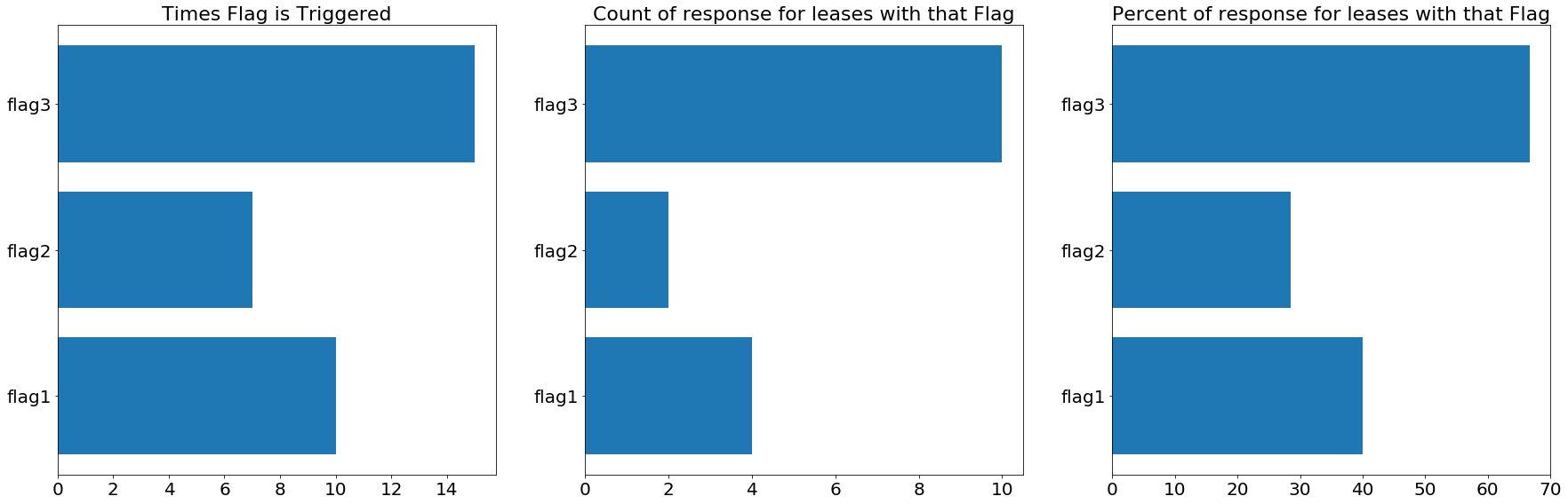
That’s all there is to it. For larger datasets, sometime the numbers on the first and second charts may need to be rotated, but I included a parameter for that in the function. I hope you find this helpful! If you do, or if you have feedback, please connect with and message me on LinkedIn.